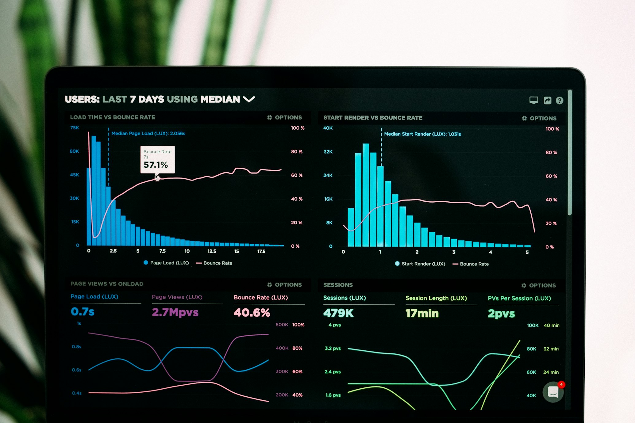
Enhanced Insights: Bar Chart Visualization For Better Data Clarity
We're excited to announce an improvement to our Insights dashboard: we've upgraded the Created vs. Completed items visualization from a line graph to a bar chart!
Why We Made This Change
While line graphs are excellent for showing trends over time, we found that bar charts provide several key advantages for comparing discrete daily data:
- Clearer daily comparisons - Side-by-side bars make it easier to directly compare how many items you created versus completed on any specific day
- Better visual distinction - The separation between data points eliminates confusion when values are similar
- Improved data interpretation - Bar heights provide a more immediate visual understanding of the relative numbers
- Reduced visual noise - Simpler representation makes patterns easier to identify at a glance
The New Visual Experience
The updated Insights dashboard now displays your 30-day activity history with vibrant, color-coded bars:
- Blue bars represent items created each day
- Green bars represent items completed each day
This visualization makes it immediately apparent whether you're keeping up with your task creation rate or falling behind, helping you maintain a sustainable productivity balance.
Real-World Benefits
This visualization improvement helps you answer important questions about your productivity:
- Which days are your most productive? Spot the days with the tallest green bars
- When do you tend to add the most tasks? Look for peaks in the blue bars
- Are you maintaining balance? Check if the green and blue bars are roughly even over time
- Are you making progress on your backlog? Look for periods where green bars consistently exceed blue ones
Part of Our Ongoing Improvements
This update is part of our commitment to continually refine and enhance FreeTodoList based on user feedback and data visualization best practices. We're dedicated to making your productivity data as accessible and actionable as possible.
Coming Next
We're working on more insights improvements, including:
- Customizable date ranges (weekly, monthly, quarterly views)
- Additional visualization options
- Export functionality for your productivity data
- More detailed breakdowns by list and category
Your Feedback Matters
Have you tried the new bar chart visualization? We'd love to hear your thoughts! Let us know what you think and what other improvements you'd like to see through our feedback form.
Check out the improved visualization on your Insights page now!
Happy organizing!
