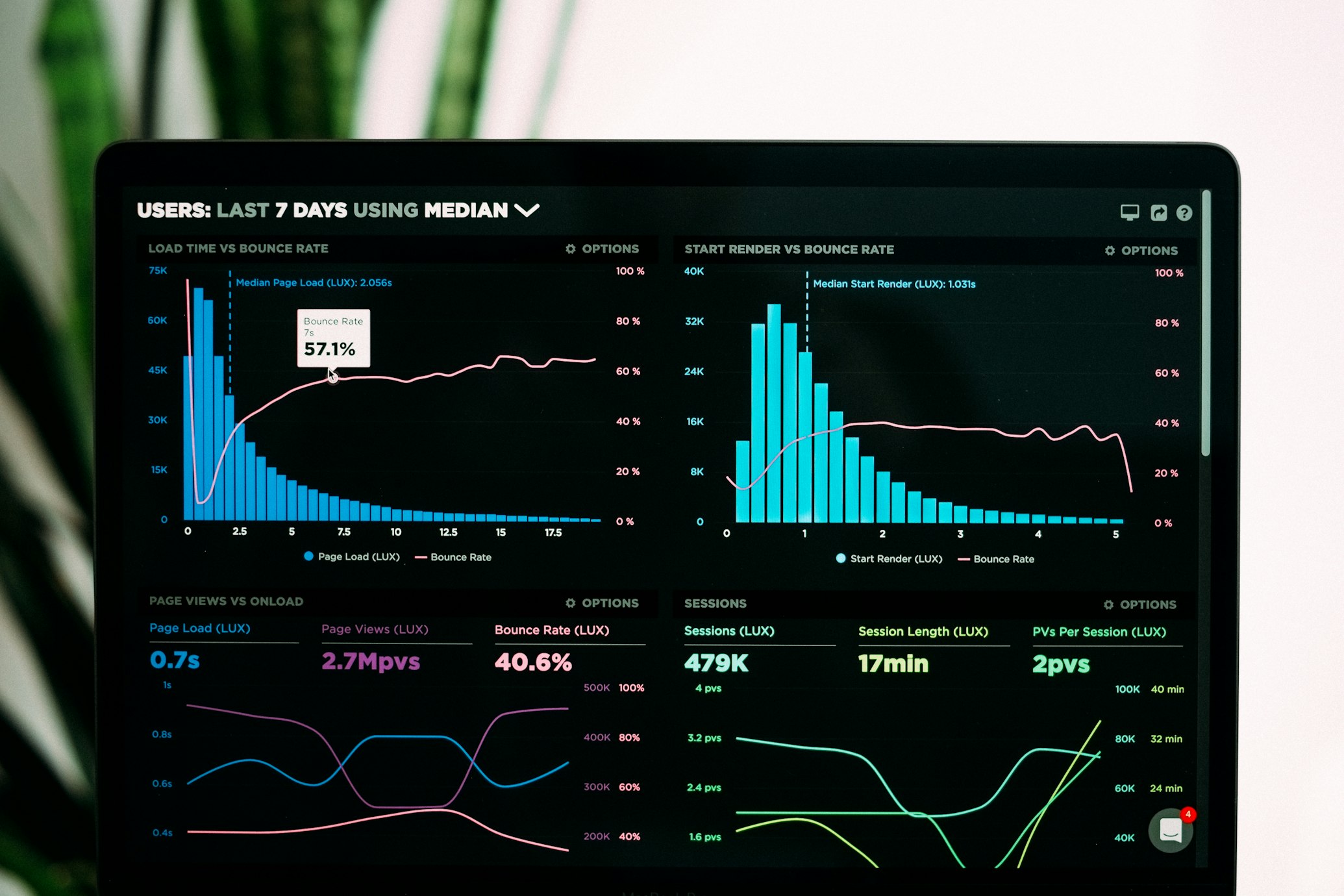
New Insights Feature: Track Created vs. Completed Items

Tracking Your Productivity: New Item Completion Graph
We're excited to announce a powerful new addition to the Insights dashboard: the Created vs. Completed items graph!
Understanding Your Task Completion Patterns
The new graph provides a visual comparison between the number of items you create and the number of items you complete each day over a 30-day period. This gives you a clear picture of your productivity trends and helps you understand your task management patterns.
Key Benefits of the New Graph
1. Visualize Your Productivity Balance
Are you creating more tasks than you're completing? Or are you efficiently working through your backlog? The new graph makes these patterns immediately apparent, helping you identify if you're maintaining a sustainable workload.
2. Track Completion Trends Over Time
See how your task completion habits change over time. Maybe you're more productive on certain days of the week, or perhaps you complete more tasks as deadlines approach. The graph helps you identify these patterns.
3. Measure Productivity Improvements
As you adopt better task management practices, watch your Completed
line rise closer to or even exceed your Created
line - a clear visual indication that you're becoming more efficient.
How We Built It
To make this feature more accurate, we've added a dedicated completed_at timestamp that records exactly when an item is marked as complete. This gives you a more precise record of your completion activity.
More Insights Coming Soon
We're continuously working to expand the insights we offer to help you better understand and improve your productivity. Some upcoming features we're considering:
- Weekly and monthly summary views
- Completion rates by list category
- Average time to completion for tasks
- Task completion forecasting
Your Feedback Matters
We'd love to hear how you're using the new insights feature! Let us know what other metrics or visualizations would be helpful for your productivity tracking.
Check out the new graph on your Insights page today!
Happy organizing!